Human perception of probability
17 Dec 2016Back in 1964, Sherman Kent tried to address the problem of misleading odds expressions in National Intelligence Estimates (NIE). Recognizing communication problems caused by imprecise probablistic statements, Kent proposed a schema for standardizing the uncertainty ranges associated with words used to communicate the likelihood of an event. In his work Words of Estimative Probability, the author defined five ranges of uncertainty and related expressions to convey them:
- Almost Certain: \(93\% \pm 6\%\)
- Probable: \(75\% \pm 12\%\)
- Chances About Even: \(50\% \pm 10\%\)
- Probably Not: \(30\% \pm 10\%\)
- Almost Certainly Not: \(7\% \pm 5\%\)
Kent defined also a set of equivalent expressions with respect to the ones defined previously:
- Almost Certain: virtually certain, highly probable, highly likely, odds (or chances) overwhelming
- Probable: likely, we believe, we estimate
- Chances About Even: chances a little better (or less) than even, improbable, unlikely
- Probably Not: we believe that…not, we estimate that…not, we doubt, doubtful
- Almost Certainly Not: virtually impossible, almost impossible, some slight chance, highly doubtful
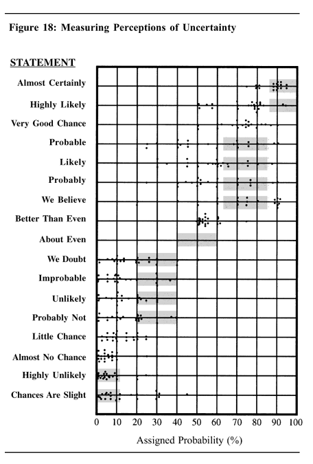
This article describes an experiment that was performed with 23 NATO military officers accustomed to reading intelligence reports. They were given a number of sentences such as: “It is highly unlikely that…”: all the sentences were the same except that the verbal expressions of probability changed. The officers were asked what percentage probability they would attribute to each statement if they read it in an intelligence report. Each dot in the table represents one officer’s probability assignment. While there was broad consensus about the meaning of “better than even”, there was a wide disparity in interpretation of other probability expressions. The shaded areas in the table show the ranges proposed by Kent.
The experiment showed how the probabilities conveyed by different expressions could be perceived by a human. In this Reddit thread, the author replicated the experiment by collecting data via subreddit r/samplesize. The data can be found here. By visualizing the notched boxplots, the results match very well the previous CIA’s experiment.
# Import files, load plot and data packages
probly <- read.csv("probly.csv", stringsAsFactors=FALSE)
library(ggplot2)
library(reshape2)
library(scales)
library(RColorBrewer)
library(ggthemes)
# Melt data into column format.
probly <- melt(probly)
probly$variable <- gsub("[.]"," ",probly$variable)


# Reorder probability levels
probly$variable <- factor(probly$variable,
                          c("Chances Are Slight",
                            "Highly Unlikely",
                            "Almost No Chance",
                            "Little Chance",
                            "Probably Not",
                            "Unlikely",
                            "Improbable",
                            "We Doubt",
                            "About Even",
                            "Better Than Even",
                            "Probably",
                            "We Believe",
                            "Likely",
                            "Probable",
                            "Very Good Chance",
                            "Highly Likely",
                            "Almost Certainly"))
#Plot probability data
ggplot(probly,aes(reorder(variable, value, FUN=median),value))+
  geom_boxplot(aes(fill=variable),alpha=.5, notch=TRUE)+
  geom_jitter(aes(color=variable),size=4,alpha=.2)+
  coord_flip()+
  guides(fill=FALSE,color=FALSE)+
  xlab("Sentence")+
  ylab("Assigned Probability (%)")+
  theme_few(base_size = 16)+
  theme(panel.border = element_blank())+
  theme(panel.grid.major.x =element_line(color="grey90",size=.25)) +
  scale_y_continuous(breaks=seq(0,100,10))

From the graph, several things draw the attention. Particularly interesting are the outliers of terms such as:
- “Highly likely” at \(15\%\)
- “We believe” and “Better than even” at \(5\%\)
and, from the opposite side:
- “Probably not”, “We doubt”, “Little chance” at \(100\%\)
- “Highly unlikely”, “Almost no chance” at \(90-95\%\)
An interesting question could be to investigate how and what people’s experiences lead to such out-of-box judgements! The notched boxplots permit to compare groups: if the notches of two boxes do not overlap, this suggests that the medians are significantly different. The notches represents an empirical \(95\%\) confindence interval on the group median. It is then possible to visually cluster the expressions:
- Highly Likely, Almost Certainly
- Probably, We Believe, Likely, Probable, Very Good Chance
- About Even, Better Than Even
- Chances Are Slight, Little Chance, Probably Not, Unlikely, Improbable, We Doubt
- Almost No Chance, Highly Unlikely
Starting from similar analysis, the book Critical Thinking For Strategic Intelligence provides some guidelines for analysts who need to translate their findings to the general public, for example:
- Try to minimize use of such words as might or could because sentences that contain them usually convey little useful information to the reader
- The best way to convey a level of likelihood is to follow the probabilistic word, percentage, or bettor’s odd with the word because and a response to complete the sentence that includes a list of key factors that support the judgement
- A good technique for assessing the soundness of a numeric probability judgement is to check if the percentage of a hypothesis being wrong and the percentage of it being right add to 100
- The key to presenting levels of confidence is for analysts to state not just how confident they are as analysts, but why they are confident
- A source summary statement is a powerful tool for giving readers an overall sense of an analyst’s level of confidence and the quality of the sources used to support the analysis before they start reading the paper
In conclusion, by providing the customers with explicit language laying out why a specific word or percentage was selected, they can make their own independent calculations of the probability of event occurring. The analyst, having knowledge of how a specific sentence is interpreted, can refine his language to better convey information.
The entire code for this post can be found here.